
Your bread and butter as a designer, well…is to design. Once in while you may get asked to knock-up some quick UI concepts. It could be for a new role or your existing organisation may require some sort of POC. Commonly, they’ll both have nothing to give you in terms of a brief or a spec but whole lot ambiguity. This is pretty standard, so get used to it! It is even more common that you will be given a screen grab of a previous or current design that they are wishing to improve upon. This is commonly known in the field as a design challenge. The idea being to tease your creativity and tease out some new ideas.
“Here’s one I made earlier.”
(Quote; Blue Peter, well known British kids TV show)
The Approach
Pick a Tool
I would recommend using a tool you’re familiar with as the learning curve associated with learning something new will inevitably add time to your challenge. So go with Sketch, XD, whatever floats your boat. Choosing to ignore my own advice I decided to fire up a trial version of MockPlus.
Apply some UX fundamentals
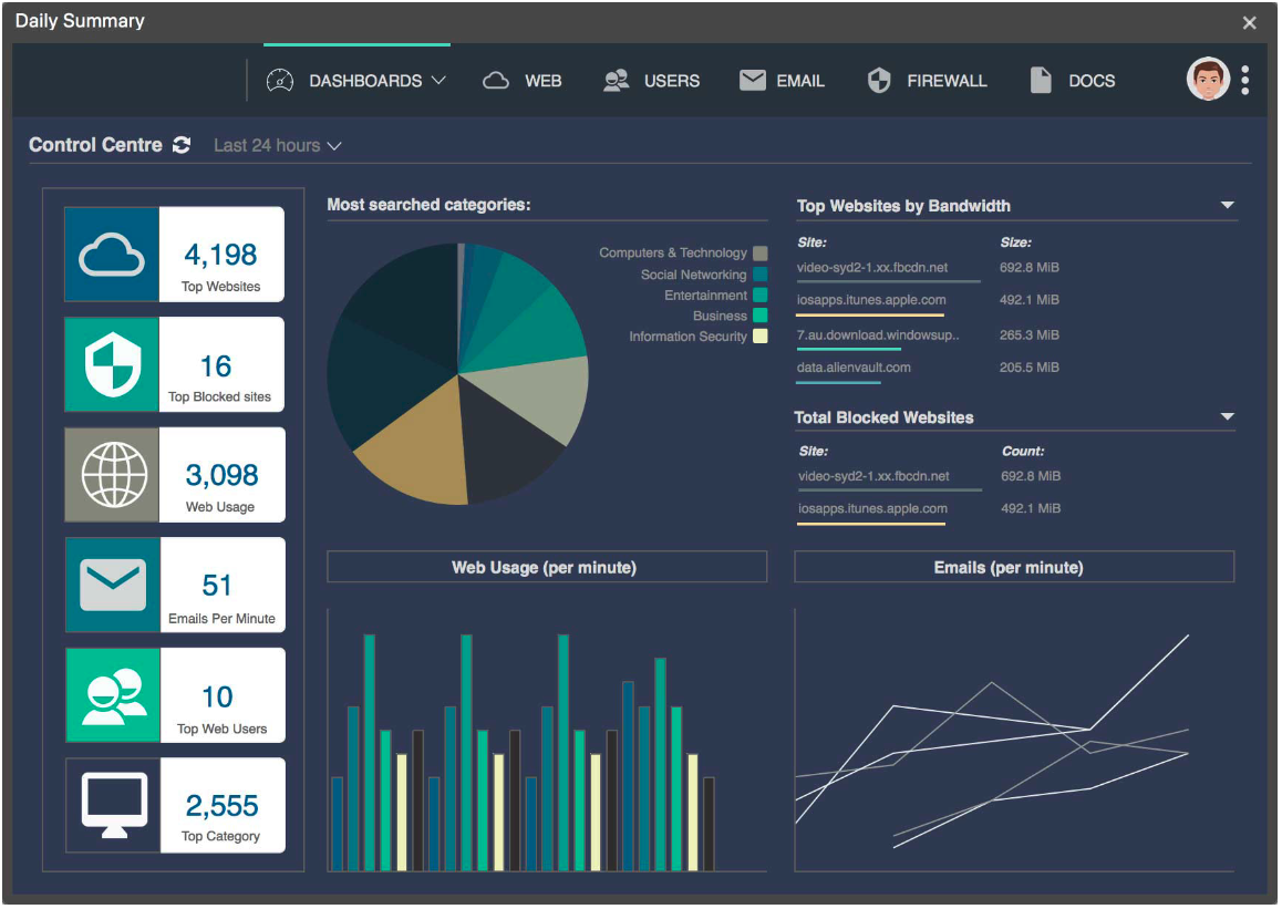
This dashboard was looking some what cluttered and a bit dated. It was in need of a quick makeover. I took some time to review the challenge and the screen above and attempted to get into my ‘Experience Design’ head-space. I viewed it from a user’s perspective to see which elements in the interface were causing me the most cognitive friction. I was attempting to anticipate the overall feel for the user.
Next step…apply some of the principles of how a good user interface should look.
Familiarity
Being around things that you are used to is comforting. It’s no different for a user interacting with a computer system. We’re all aware of hamburger menus, screen windows or iconography, so we intentionally include familiar elements to our interface. We try to aim for that sweet-spot where an interface element is so inherently familiar that it almost renders it invisible to the user, allowing them to interact with it in the most seamless way.
Examples include the avatar to indicate that the user can view a profile page. The ellipse icon is symbolic of a menu with a list of actions for the user to select.
Colours
As we already know colours play a significant part in design. There are colours that will make you smile and colours to make you run a mile. However, it is a subjective topic and often divides opinion. In this case we need a palette that offers the user direction and association. For example the dark blue is associated with a button that is currently selected to illustrate to the user where they currently are within this portal.
Simplicity
This is quoted time and time and time again but the KISS (Keep It Simple Stupid) principle is key to a great UI. The best interfaces are almost invisible to the user. Here, we try to avoid any unnecessary elements and communicate to the user using clear language and recognisable icons.
Consistency
There’s consistency created in the layout and design throughout the interface to help facilitate efficiency. Once a user learns how to do something, they should be able to transfer that skill to other parts of the site. In my concepts below there is consistency expressed through the icons and the colours. The summary boxes that represent the primary data types to be displayed and the figures jump out at the user. In both light and dark concepts the pie chart and the other graphs are consistent in presentation.
Flow
By nature the human eye will scan a page from left to right, top to bottom. In both concepts below items have been carefully placed with considered spatial relationships to help draw attention to the most important pieces of information which should also aid scanning and readability.
Challenge complete
That’s it! Design done, ship it for review. It is always good practice to follow a few simple principles. It helps you to justify your design choices and instils confidence in your own abilities as a designer.